作者肝了好几天才做好的openlist赛博朋克主题,一共两个文件,自定义头部和自定义内容。
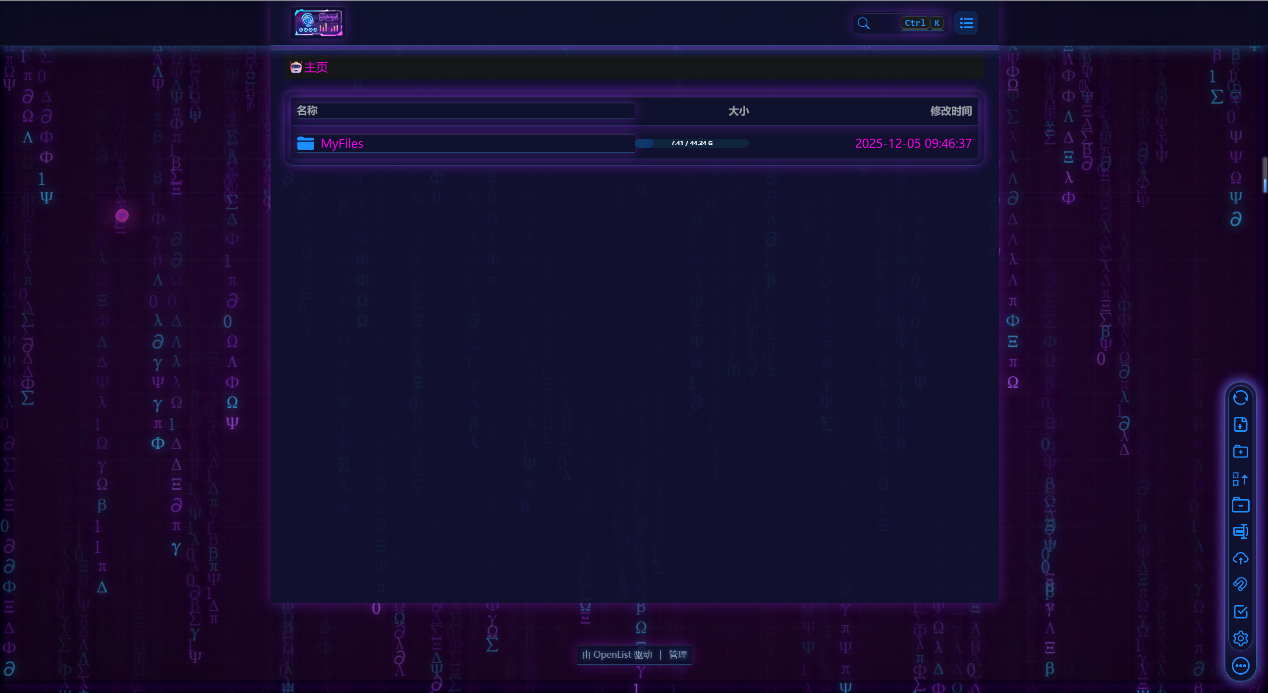
主题包含以下几个方面:打开后循环字符雨,有三种不同的速度,整体风格为赛博之城,霓虹灯闪烁。每隔3~6秒画面进行故障闪烁,在这个页面鼠标有亮粉红色拖尾特效🌠️以及点击的粒子爆炸💥特效。电脑端进入网盘页面后自动播放科技感十足的音乐。
因为代码比较多,差不多600行左右,并且渲染的东西也比较多,打开可能会卡。😁
代码仅供学习,严禁商用!
<meta charset="UTF-8">
<style>
html {
  color-scheme: light !important;
  --darkreader-neutral-background: initial !important;
  --darkreader-neutral-text: initial !important;
  --darkreader-selection-background: initial !important;
  --darkreader-selection-text: initial !important;
}
</style>

<!-- glitch 滤镜 -->
<svg id="glitch-svg" style="position:absolute;width:0;height:0;">
  <filter id="glitch-filter">
    <feColorMatrix type="matrix"
      values="1.3 0 0 0 0
              0 1.3 0 0 0
              0 0 1.3 0 0
              0 0 0 1 0"/>
    <feOffset dx="3" dy="0" result="r"/>
    <feOffset dx="-3" dy="0" result="g"/>
    <feBlend in="r" in2="g" mode="screen"/>
  </filter>
</svg>

<style>
/*
   1) 全局背景:HUD 网格 + 扫描线 + 微色相漂移
*/
body {
  margin: 0;
  background:
    radial-gradient(circle at 20% 20%, rgba(56,189,248,0.22) 0, transparent 52%),
    radial-gradient(circle at 80% 80%, rgba(147,51,234,0.22) 0, transparent 52%),
    #37002d !important;
  font-family: system-ui,-apple-system,BlinkMacSystemFont,"Segoe UI",sans-serif;
  color: #f100ed;
  animation: hueShift 18s linear infinite;
}

/* 扫描线 */
body::after {
  content: "";
  position: fixed;
  inset: 0;
  pointer-events: none;
  background-image: linear-gradient(rgba(255,255,255,0.04) 1px, transparent 1px);
  background-size: 100% 3px;
  mix-blend-mode: soft-light;
  z-index: -1;
}

/* HUD 网格 + 暗角 */
body::before {
  content: "";
  position: fixed;
  inset: 0;
  pointer-events: none;
  background-image:
    radial-gradient(ellipse at center, rgba(0,0,0,0) 40%, rgba(0,0,0,0.55) 100%),
    linear-gradient(rgba(148,163,184,0.05) 1px, transparent 1px),
    linear-gradient(90deg, rgba(148,163,184,0.05) 1px, transparent 1px);
  background-size: 100% 100%, 45px 45px, 45px 45px;
  animation: gridMove 40s linear infinite;
  opacity: .75;
  z-index: -2;
}

@keyframes gridMove {
  0% { transform: translate(0,0); }
  100% { transform: translate(-45px,-45px); }
}

@keyframes hueShift {
  0%   { filter: hue-rotate(0deg); }
  50%  { filter: hue-rotate(8deg); }
  100% { filter: hue-rotate(0deg); }
}

/*
   2) 顶部导航栏(适配 Hope UI 三层)
 */
/* 最外层导航容器 */
div[class*="hope-center"] {
  background: rgba(10,12,32,0.82) !important;
  border-bottom: 1px solid rgba(56,189,248,0.35) !important;
  backdrop-filter: blur(20px) saturate(160%);
  -webkit-backdrop-filter: blur(20px) saturate(160%);
  box-shadow:
    inset 0 1px 0 rgba(255,255,255,0.15),
    0 0 20px rgba(56,189,248,0.45);
}

/* 第二层蓝条 */
div[class*="hope-stack"]:first-of-type {
  background: rgba(15,18,48,0.9) !important;
  border-bottom: 1px solid rgba(56,189,248,0.35) !important;
  box-shadow:
    0 0 18px rgba(147,51,234,0.4),
    inset 0 1px 0 rgba(255,255,255,0.12) !important;
}

/* 面包屑条 */
div[class*="hope-c-"][class*="PILV"][class*="iT0B"] {
  background: rgba(20,25,60,0.88) !important;
  color: #12102F !important;
  border-bottom: 1px solid rgba(56,189,248,0.35) !important;
  backdrop-filter: blur(18px);
  box-shadow:
    0 0 10px rgba(56,189,248,0.35),
    0 0 20px rgba(147,51,234,0.35);
}

div[class*="hope-c-"][class*="PILV"] a,
div[class*="hope-c-"][class*="PILV"] span {
  color: #12102F !important;
  font-weight: 600;
  letter-spacing: .08em;
  text-shadow:
    0 0 8px rgba(56,189,248,0.9),
    0 0 16px rgba(147,51,234,0.75);
}

div[class*="hope-c-"][class*="PILV"] svg {
  filter: drop-shadow(0 0 6px rgba(56,189,248,0.9));
}

/* 顶部圆形菜单按钮*/
button.round, .navbar .right .el-button {
  border-radius: 50% !important;
  width: 42px; height: 42px;
  background: radial-gradient(circle at 30% 30%, #3b82f6, #7e22ce) !important;
  box-shadow:
    0 0 10px rgba(56,189,248,0.8),
    0 0 20px rgba(147,51,234,0.6);
}

/*
   3) 文件区域:卡片 + 表格
 */
.file-list, .file-container, .el-card, .el-table {
  background: rgba(15,23,42,0.82) !important;
  border-radius: 18px;
  border: 1px solid rgba(59,130,246,0.55);
  backdrop-filter: blur(20px);
  box-shadow:
    0 0 14px rgba(56,189,248,0.4),
    0 0 26px rgba(147,51,234,0.25),
    inset 0 0 6px rgba(56,189,248,0.35);
}

/* 行基础 */
.file-item,
.el-table__row {
  position: relative;
  background: transparent !important;
  border-bottom: 1px solid rgba(59,130,246,0.2);
  transition: 0.18s ease;
}

/* 行 hover:轻微抬起 / 提亮 */
.file-item:hover,
.el-table__row:hover {
  background: radial-gradient(circle at 0 0, rgba(56,189,248,0.12) 0, transparent 55%) !important;
  transform: translateY(-3px) scale(1.005);
  filter: brightness(1.1);
  box-shadow: 0 0 12px rgba(56,189,248,0.55);
}

/* 文件图标 pulsing 发光 */
.file-item:hover svg,
.el-table__row:hover svg {
  animation: pulseGlow 1.2s infinite ease-out;
}

@keyframes pulseGlow {
  0%   { filter: drop-shadow(0 0 4px #38bdf8); }
  100% { filter: drop-shadow(0 0 10px #7e22ce); }
}

/* 文件名 / 单元格文字统一提亮 */
.file-item span,
.file-item div,
.file-item a,
.el-table .cell {
  color: #12102F !important;
  font-weight: 500;
  text-shadow: 0 0 6px rgba(56,189,248,0.55);
}

/* 表头 */
.el-table th .cell {
  color: #12102F !important;
  font-weight: 600;
  letter-spacing: 0.04em;
  text-shadow:
    0 0 6px rgba(56,189,248,0.55),
    0 0 12px rgba(147,51,234,0.4);
}

/* 选中行的“扫描线”效果 */
.file-item.selected,
.el-table__row.current-row {
  background: linear-gradient(
    90deg,
    rgba(56,189,248,0) 0%,
    rgba(56,189,248,0.35) 50%,
    rgba(56,189,248,0) 100%
  ) !important;
  background-size: 200% 100%;
  animation: scanLine 0.6s ease-out;
}
@keyframes scanLine {
  from { background-position: -200% 0; }
  to   { background-position: 200% 0; }
}

/*
   4) 右侧悬浮工具栏(赛博按钮)
 */
[class*="tool"], .right-bar {
  background: rgba(15,23,42,0.9) !important;
  border-radius: 20px;
  backdrop-filter: blur(14px);
  border: 1px solid rgba(56,189,248,0.45);
  box-shadow:
    0 0 15px rgba(56,189,248,0.5),
    0 0 26px rgba(147,51,234,0.35);
}

[class*="tool"] button, .right-bar button {
  width: 44px; height: 44px;
  border-radius: 50% !important;
  background: rgba(15,23,42,0.95) !important;
  border: 1px solid rgba(56,189,248,0.9) !important;
  box-shadow:
    0 0 10px rgba(56,189,248,0.95),
    0 0 18px rgba(147,51,234,0.55);
  transition: 0.15s ease;
}
[class*="tool"] button:hover, .right-bar button:hover {
  transform: scale(1.1);
  box-shadow:
    0 0 20px rgba(56,189,248,1),
    0 0 28px rgba(147,51,234,0.8);
}

/*
   5) 上传 Dialog & 进度条
*/
.el-dialog {
  background: rgba(15,23,42,0.96) !important;
  border-radius: 20px;
  border: 1px solid rgba(147,51,234,0.6);
  box-shadow:
    0 0 25px rgba(147,51,234,0.6),
    0 0 40px rgba(56,189,248,0.45);
  animation: cyberPop 0.28s ease-out;
}
@keyframes cyberPop {
  0% { transform: scale(0.86); opacity: 0; }
  100%{ transform: scale(1);    opacity: 1; }
}

.el-progress-bar__inner {
  background: linear-gradient(90deg, #38bdf8, #7e22ce);
  box-shadow:
    0 0 10px #38bdf8,
    0 0 20px #7e22ce;
}

/*
   6) 底部 HUD 文本
*/
.footer, .copyright {
  color: #94a3b8 !important;
  text-shadow: 0 0 6px rgba(56,189,248,0.6);
  text-align: center;
  font-size: 12px;
  opacity: .9;
  margin-top: 40px;
}


/* 全局 glitch 时应用的动画:加入亮度/对比度抖动 + 更强位移 */
:root {
  --glitch-amt: 4px;  /* JS 里会动态改这个值控制闪烁强度 */
}

body.glitching {
  animation: globalGlitch 0.26s steps(2, end);
}

/* 闪烁时加强扫描线 + 轻微抖动 */
body.glitching::after {
  opacity: 1;
  animation: glitchScan 0.26s steps(2, end);
}

@keyframes globalGlitch {
  0% {
    filter: none;
    transform: translate(0, 0);
  }
  20% {
    filter: contrast(1.18) brightness(1.06) url('#glitch-filter');
    transform:
      translate(calc(var(--glitch-amt) * -1), 2px)
      skewX(-1.2deg);
  }
  40% {
    filter: none;
    transform:
      translate(2px, calc(var(--glitch-amt) * -0.4))
      skewX(0.4deg);
  }
  60% {
    filter: saturate(1.25) brightness(1.12) url('#glitch-filter');
    transform:
      translate(calc(var(--glitch-amt)), -2px)
      skewX(1.1deg);
  }
  80% {
    filter: none;
    transform: translate(-1px, 1px);
  }
  100% {
    filter: none;
    transform: translate(0, 0);
  }
}

/* 扫描线抖动一点位置,营造电子噪点感 */
@keyframes glitchScan {
  0% {
    background-position-y: 0;
  }
  100% {
    background-position-y: 3px;
  }
}


/* 文件 hover 的故障边框扫动 */
.file-item:hover::after,
.el-table__row:hover::after {
  content: "";
  position: absolute;
  inset: 0;
  border: 1px solid rgba(56,189,248,0.55);
  pointer-events: none;
  animation: glitchBorder 0.25s steps(3,end);
}

@keyframes glitchBorder {
  0%  { clip-path: inset(0 0 80% 0); }
  25% { clip-path: inset(40% 0 40% 0); }
  50% { clip-path: inset(80% 0 0 0); }
  75% { clip-path: inset(30% 0 30% 0); }
  100%{ clip-path: inset(0 0 80% 0); }
}

/* 鼠标激光拖尾的光点 */
.laser-dot {
  position: fixed;
  width: 10px;
  height: 10px;
  border-radius: 50%;
  pointer-events: none;
  background: radial-gradient(circle, #7e22ce, #ed3c80);
  box-shadow: 0 0 12px #7e22ce, 0 0 20px #ed3c80;
  z-index: 9999;
  animation: laserFade 0.6s forwards;
}

@keyframes laserFade {
  0%   { opacity: 1;   transform: scale(1); }
  60%  { opacity: 0.7; transform: scale(1.8); }
  100% { opacity: 0;   transform: scale(2.6); }
}

/* 粒子基础样式 */
.particle {
  position: fixed;
  width: 6px;
  height: 6px;
  border-radius: 50%;
  pointer-events: none;
  background: radial-gradient(circle, #7e22ce, #ed3c80);
  box-shadow: 0 0 10px #7e22ce, 0 0 18px #ed3c80;
  opacity: 1;
  z-index: 9999;
  animation: particle-explode 0.5s ease-out forwards;
}

@keyframes particle-explode {
  0% {
    transform: translate(0,0) scale(1);
    opacity: 1;
  }
  100% {
    transform: translate(var(--dx), var(--dy)) scale(0.4);
    opacity: 0;
  }
}
</style>
<!-- 数字雨画布 -->
<canvas id="matrixRain"
  style="position:fixed;top:0;left:0;width:100vw;height:100vh;pointer-events:none;z-index:-3;"></canvas>

<script>
// 数字雨:三层不同速度与透明度
(function(){
  const canvas = document.getElementById("matrixRain");
  const ctx = canvas.getContext("2d");

  function resize(){
    canvas.width = window.innerWidth;
    canvas.height = window.innerHeight;
  }
  window.addEventListener("resize", resize);
  resize();

  const chars = "01ΛΞΦΨ∑∂πΩβγΔλ";
  const fontSize = 25;

  function makeLayer(speed, opacity){
    return {
      speed,
      opacity,
      drops: Array(Math.floor(canvas.width / fontSize)).fill(0)
    };
  }

  let layers = [
    makeLayer(1.1, 0.95),
    makeLayer(0.7, 0.6),
    makeLayer(0.35, 0.3)
  ];

  function draw(){
    ctx.fillStyle = "rgba(0,0,0,0.09)";
    ctx.fillRect(0,0,canvas.width,canvas.height);
    ctx.font = fontSize + "px monospace";

    layers.forEach(layer=>{
      layer.drops.forEach((y, i)=>{
        const text = chars[Math.floor(Math.random()*chars.length)];
        const colors = [
          `rgba(56,189,248,${layer.opacity})`,
          `rgba(147,51,234,${layer.opacity})`,
          `rgba(168,85,247,${layer.opacity})`
        ];
        const color = colors[Math.random()*3 | 0];
        ctx.fillStyle = color;
        ctx.shadowColor = color;
        ctx.shadowBlur = 15;
        ctx.fillText(text, i*fontSize, y*fontSize);

        if (y*fontSize > canvas.height && Math.random() > 0.975) {
          layer.drops[i] = 0;
        }
        layer.drops[i] += layer.speed;
      });
    });

    requestAnimationFrame(draw);
  }
  draw();
})();
</script>

<!-- 全局 glitch 随机触发 -->
<script>
/**
 * intensity:0~1 之间,越大抖动越狠
 */
function triggerGlitch(intensity = 1) {
  // 根据强度动态调整像素位移
  const amtPx = 2 + intensity * 10; // 像素偏移
  document.documentElement.style.setProperty('--glitch-amt', amtPx + 'px');

  document.body.classList.add('glitching');
  // 和 CSS 中 globalGlitch 的时长保持一致
  setTimeout(() => {
    document.body.classList.remove('glitching');
  }, 260);
}

/**
 * 一次“爆发”里连续闪若干下
 */
function glitchBurst() {
  const burstCount = 1 + Math.floor(Math.random() * 4); // 1~4次闪烁
  let count = 0;

  function singleFlash() {
    const intensity = Math.random(); // 0~1 随机强度
    triggerGlitch(intensity);
    count++;
    if (count < burstCount) {
      // 闪与闪之间间隔s,模拟电子抽风
      const gap = 100 + Math.random() * 120;
      setTimeout(singleFlash, gap);
    }
  }

  singleFlash();
}

/**
 * 整体调度板块
 */
(function scheduleGlitchLoop() {
  const delay = 2000 + Math.random() * 5000; // 2~7秒之间
  setTimeout(() => {
    if (Math.random() < 0.9) {
      glitchBurst();
    }
    scheduleGlitchLoop();
  }, delay);
})();
</script>


<script>
document.addEventListener("mousemove",(e)=>{
  // 性能优化部分
  const d=document.createElement("div");
  d.className="laser-dot";
  d.style.left=e.clientX+"px";
  d.style.top=e.clientY+"px";
  document.body.appendChild(d);
  setTimeout(()=>d.remove(),600);
}, true);
</script>

<script>
function particleBurst(x,y){
  for(let i=0;i<20;i++){
    const p=document.createElement("div");
    p.className="particle";
    const ang=Math.random()*Math.PI*2;
    const dis=30+Math.random()*60;
    p.style.left=x+"px";
    p.style.top=y+"px";
    p.style.setProperty("--dx", Math.cos(ang)*dis+"px");
    p.style.setProperty("--dy", Math.sin(ang)*dis+"px");
    document.body.appendChild(p);
    setTimeout(()=>p.remove(),500);
  }
}

document.addEventListener("click",(e)=>{
  // 获取点击路径
  const path = e.composedPath?.() || [];
  let hit=false;

  // 判定是否点击在特定元素上才触发
  for(const n of path){
    if(!n) continue;
    const tag=(n.tagName||"").toLowerCase();
    const cls=(n.className||"").toString();

    // 只要点击了表格、文件项、或者 Hope UI 的主要容器,都触发
    if(
      tag==="tr" || tag==="td" ||
      cls.includes("file") ||
      cls.includes("el-table") ||
      cls.includes("hope") ||
      tag === "body" /* [可选] 增加 body 确保点击背景也触发 */
    ){
      hit=true; break;
    }
  }

  if(hit) particleBurst(e.clientX,e.clientY);
}, true);
</script>

<!-- 背景音乐 -->
<audio id="bgm" autoplay muted loop playsinline>
  <source src="https://sjy1218.com/upload/saibo.mp3" type="audio/mpeg">
</audio>

<script>
// PC + 手机兼容的自动播放 + 解锁声音
const bgm = document.getElementById("bgm");

// DOM 就绪时先静音播放
document.addEventListener("DOMContentLoaded", () => {
  bgm.play().catch(() => {});
});

// 第一次点击/触摸后解锁声音
function unlockAudio() {
  bgm.muted = false;
  bgm.volume = 0.5;
  bgm.play().catch(() => {});

  document.removeEventListener("click", unlockAudio);
  document.removeEventListener("touchstart", unlockAudio);
}
document.addEventListener("click", unlockAudio);
document.addEventListener("touchstart", unlockAudio);
</script>